Building RideGT

Georgia Tech runs a real bus network across campus, and the official tool shows you where every bus is right now: live dots sliding around a map. That answers the question where is the bus. It does not answer the question everyone actually has, which is: I'm here, I need to get there, is a bus worth it, and which one do I get on?
Answering that yourself meant knowing the routes by heart, guessing which stop was closest to where you were going, and then watching a dot to work out whether it was coming toward you or driving away. Most people gave up and walked.
So I built RideGT, a campus public transport routing system for Georgia Tech students, serving 2,000+ users. You type where you're going and it hands you a trip: walk here, get on this bus, get off here, walk there. It started as a heuristic in one Python file in September 2025 and now runs on iOS, Android and the web. Download it here!
Before
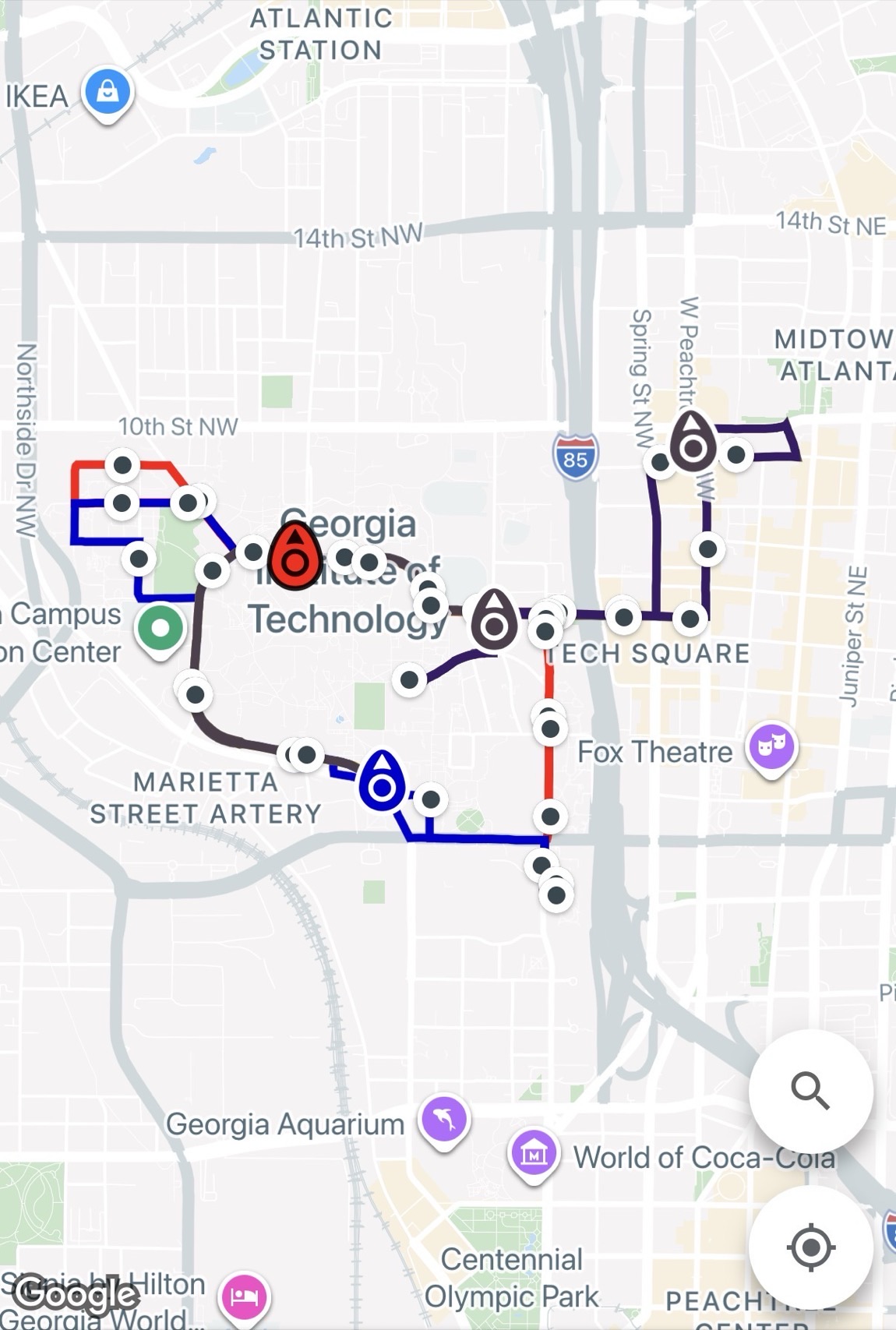
The only thing students had was a map with every route stacked on top of it. You could see where the buses were, but there was no way to turn a place name into a trip.
After (my app)
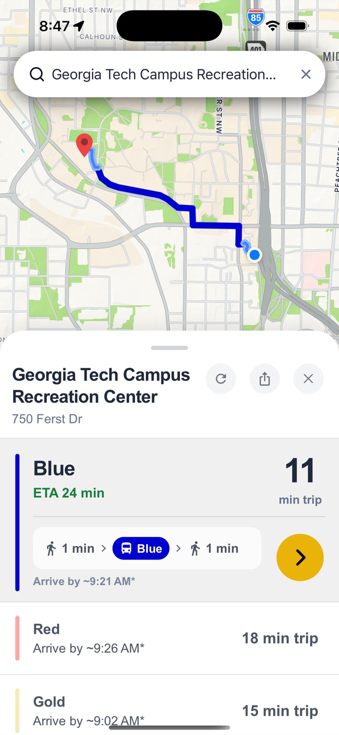
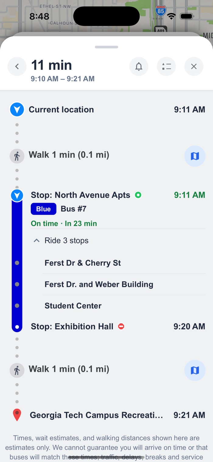
You type a destination and get ranked options with real trip times, then the trip itself: which bus to board, how many stops to sit through, where to get off, walking directions at both ends, and an alert when your stop is coming up.
How the routing works
Every search runs the same five steps:
- Work out where you are and where you're going.
- Throw away every route that has no bus actually moving on it. A perfect route with no bus is not an option.
- Shortlist a few stops near you, and a few near where you're going.
- Price every combination of those and pick the best. This is the hard one.
- Rank whatever survived and show you the best few.
The result is a list you can choose from, and then a trip you can follow: which bus, which stop, how many stops to sit through, and how long you'll be walking at either end.
Step four is where nearly all the difficulty is. Getting it wrong is subtle enough that it shipped, looked fine, and quietly sent people walking in the wrong direction for weeks.
The biggest problem I am still solving
A parked bus still looks like a bus on its way. Drivers take breaks, shifts change, a bus sits at the end of the line, and the feed keeps reporting it as on-route, so the countdown keeps ticking down for a bus that is never coming.
We watch every bus continuously, and if one hasn't left a 25-metre circle for longer than that stop should take, we mark it stalled instead of counting it down. Most of the work is separating three things that look identical from outside: a bus genuinely parked, a bus idling nowhere near a stop, and a bus whose transponder just stopped reporting. That last one looks parked, but the data is simply stale, and calling it a stall would be wrong in a different way.
What's still wrong: the "how long is too long" number leans on the single generic dwell time the feed claims for each stop. But some stops are a ten-second pickup and others are a routine layover, and one number cannot be right for both. We're recording real dwell times now so each stop can learn its own normal from its own history instead of borrowing someone else's.
How I cut a $3,300 monthly bill down to $50
Every walking distance in this app is a question Google charges me to answer, and I am a student paying for this out of pocket. At the usage I was planning for, roughly a thousand searches a day, the Google bill came to about $3,300 a month. That is not a bill a free campus app survives.
It is now about $50 a month at the same usage. Nothing was removed to get there, and no feature got worse. The app just stopped paying for the same answer twice.
Three things did almost all of it.
Asking for less. The expensive call was the one that priced walking distances, and it charged per pair of points. One search was asking about 52 pairs at once when it only ever needed 15 of them. Narrowing the question was free and cut two thirds of the cost before any caching existed.
Remembering the answers. The walking distance between two fixed points does not change, so once we have paid for a walk we keep it and reuse it forever. It sits in the server's own memory for instant reads, and behind that in a shared store that every copy of the server can read, so a second server never re-buys something the first one already paid for. Once those answers are warm, a repeated search costs nothing at all.
That last part nearly did not work, for a reason worth knowing. Bus stops are always in exactly the same place, so those lookups matched every time. But your end of the walk is live GPS, which never reports the same position twice. Two readings a metre apart looked like two completely different questions, so the walk from you to your bus stop was re-bought on almost every search. The fix was to stop treating your location as an exact point: everything snaps to a rough 10-metre grid, and near misses check the neighbouring squares before paying. Ten metres is smaller than the error in a phone's GPS and far smaller than the distance between competing stops, so it cannot change which bus you are told to take.
Not asking at all until it matters. The search box used to look up suggestions on the first letter you typed. It now waits for three, which is the difference between paying for "a" and paying for "arc".
What is left is the address lookup that runs when you pick a destination, which is the priciest thing the app touches and the only cost that still grows with users. I have deliberately not optimised it yet, because the first month of real usage will tell me whether it stays inside Google's free allowance. Building a cache for a bill that may not exist is how you waste a week.
The live bus data is solved from the other end. Instead of every request reaching out to the campus system, the server keeps one shared live copy of every bus, refreshed continuously in the background, with route shapes and stop lists refreshed every ten minutes. A hundred people searching at once is still one conversation with the campus feed, and because the map, the search, the arrival times and the stall check all read that same copy, they cannot contradict each other.
Ads that are worth looking at
There's a banner along the bottom of the map, and it is not an ad network. The posts come from Georgia Tech students and student organizations: club meetings, campus events, auditions. They come in through a small portal, and every one is read by a person before it can appear.
Everyone who sees it is on the same campus, looking at it in the moment they're deciding where to go. An ad for something two thousand miles away is noise. A flyer for something happening in the building you're riding toward is not really an ad at all.
What I learned
Building for two thousand people is a different job than building for myself. Most of the work after launch went into the app behaving sensibly when a transponder died or a semester ended, the best fixes started as one annoyed sentence through the feedback button, and the harness that told me my obvious fix was wrong is the only reason I didn't ship it.